728x90
반응형
title: StoryBook Adjust
date: 2023-02-05 15:31:00 +0900
category: react
draft: false
설치 및 setup
# js 버전 설치
npm create vite@latest project -- --template react
# ts 버전 설치
npm create vite@latest project -- --template react-ts
# 해당 프로젝트로 이동
cd project
# 해당 프로젝트에 storybook 설치
npx sb init --builder @storybook/builder-vite
# storybook 실행
npm run storybooknpm -v
8.1.2
npx storybook@next upgrade --prerelease- 버전 정보
스토리북 설치 시
- 스토리북 자체에 나타나게 하기위한 파일 구성
- button.jsx | button.tsx
- button.module.css
- button.stories.jsx | button.stories.tsx
- 실제 x.stories.jsx | x.stories.tsx 파일이 보여지는 부분임
- 스토리북에 폴더 구조 나누는 방법
css 공통
.buttonMain {
font-family: 'Nunito Sans', 'Helvetica Neue', Helvetica, Arial, sans-serif;
font-weight: 700;
border: 0;
border-radius: 3em;
cursor: pointer;
display: inline-block;
line-height: 1;
}
.buttonPrimary {
color: white;
background-color: #1ea7fd;
}
.buttonSecondary {
color: #333;
background-color: transparent;
box-shadow: rgba(0, 0, 0, 0.15) 0px 0px 0px 1px inset;
}
.buttonSmall {
font-size: 12px;
padding: 10px 16px;
}
.buttonMedium {
font-size: 14px;
padding: 11px 20px;
}
.buttonLarge {
font-size: 16px;
padding: 12px 24px;
}
js 버전 설치시
css 형식 적용시
import React from "react";
import PropTypes from "prop-types";
import "./Button.css";
/**
* Primary UI component for user interaction
*/
export const Button = ({ primary, backgroundColor, size, label, ...props }) => {
const mode = primary ? "buttonPrimary" : "buttonSecondary";
return (
<button
type="button"
className={["buttonMain", `button${size}`, mode].join(" ")}
style={backgroundColor && { backgroundColor }}
{...props}
>
{label}
</button>
);
};
Button.propTypes = {
/**
* Is this the principal call to action on the page?
*/
primary: PropTypes.bool,
/**
* What background color to use
*/
backgroundColor: PropTypes.string,
/**
* How large should the button be?
*/
size: PropTypes.oneOf(["Small", "Medium", "Large"]),
/**
* Button contents
*/
label: PropTypes.string.isRequired,
/**
* Optional click handler
*/
onClick: PropTypes.func,
};
Button.defaultProps = {
backgroundColor: null,
primary: false,
size: "Medium",
onClick: undefined,
};module.css 적용시
import React from "react";
import PropTypes from "prop-types";
import css from "./Button.module.css";
/**
* Primary UI component for user interaction
*/
export const Button = ({ primary, backgroundColor, size, label, ...props }) => {
const mode = primary ? css.buttonPrimary : css.buttonSecondary;
const sizeMode = {
Small: css.buttonSmall,
Medium: css.buttonMedium,
Large: css.buttonLarge,
};
return (
<button
type="button"
// className={["buttonMain", `button${size}`, mode].join(" ")}
className={css.buttonMain + " " + sizeMode[size] + " " + mode}
style={backgroundColor && { backgroundColor }}
{...props}
>
{label}
</button>
);
};
Button.propTypes = {
/**
* Is this the principal call to action on the page?
*/
primary: PropTypes.bool,
/**
* What background color to use
*/
backgroundColor: PropTypes.string,
/**
* How large should the button be?
*/
size: PropTypes.oneOf(["Small", "Medium", "Large"]),
/**
* Button contents
*/
label: PropTypes.string.isRequired,
/**
* Optional click handler
*/
onClick: PropTypes.func,
};
Button.defaultProps = {
backgroundColor: null,
primary: false,
size: "Medium",
onClick: undefined,
};
.stories.jsx
import React from 'react';
import { ComponentStory, ComponentMeta } from '@storybook/react';
import { Button } from './Button';
// More on default export: https://storybook.js.org/docs/react/writing-stories/introduction#default-export
export default {
title: 'Example/Button',
component: Button,
// More on argTypes: https://storybook.js.org/docs/react/api/argtypes
argTypes: {
backgroundColor: { control: 'color' },
},
} as ComponentMeta<typeof Button>;
// More on component templates: https://storybook.js.org/docs/react/writing-stories/introduction#using-args
const Template: ComponentStory<typeof Button> = (args) => <Button {...args} />;
export const Primary = Template.bind({});
// More on args: https://storybook.js.org/docs/react/writing-stories/args
Primary.args = {
primary: true,
label: 'Button',
};
export const Secondary = Template.bind({});
Secondary.args = {
label: 'Button',
};
export const Large = Template.bind({});
Large.args = {
size: 'large',
label: 'Button',
};
export const Small = Template.bind({});
Small.args = {
size: 'small',
label: 'Button',
};
ts 버전 설치시
css 적용시
import React from "react";
import "./button.css";
interface ButtonProps {
/**
* Is this the principal call to action on the page?
*/
primary?: boolean;
/**
* What background color to use
*/
backgroundColor?: string;
/**
* How large should the button be?
*/
size?: "Small" | "Medium" | "Large";
/**
* Button contents
*/
label: string;
/**
* Optional click handler
*/
onClick?: () => void;
}
/**
* Primary UI component for user interaction
*/
export const Button = ({
primary = false,
size = "Medium",
backgroundColor,
label,
...props
}: ButtonProps) => {
const mode = primary ? "buttonPrimary" : "buttonSecondary";
return (
<button
type="button"
className={["buttonMain", `button${size}`, mode].join(" ")}
style={{ backgroundColor }}
{...props}
>
{label}
</button>
);
};
module.css 적용시
import React from "react";
import css from "./Button.module.css";
interface ButtonProps {
/**
* Is this the principal call to action on the page?
*/
primary?: boolean;
/**
* What background color to use
*/
backgroundColor?: string;
/**
* How large should the button be?
*/
size?: "Small" | "Medium" | "Large";
/**
* Button contents
*/
label: string;
/**
* Optional click handler
*/
onClick?: () => void;
}
/**
* Primary UI component for user interaction
*/
export const Button = ({
primary = false,
size = "Medium",
backgroundColor,
label,
...props
}: ButtonProps) => {
const mode = primary ? css.buttonPrimary : css.buttonSecondary;
const sizeMode = {
Small: css.buttonSmall,
Medium: css.buttonMedium,
Large: css.buttonLarge,
};
return (
<button
type="button"
className={css.buttonMain + " " + sizeMode[size] + " " + mode}
style={{ backgroundColor }}
{...props}
>
{label}
</button>
);
};
stories.tsx
import React from "react";
import { ComponentStory, ComponentMeta } from "@storybook/react";
import { Button } from "./Button";
// More on default export: https://storybook.js.org/docs/react/writing-stories/introduction#default-export
export default {
title: "Example/Button",
component: Button,
// More on argTypes: https://storybook.js.org/docs/react/api/argtypes
argTypes: {
backgroundColor: { control: "color" },
},
} as ComponentMeta<typeof Button>;
// More on component templates: https://storybook.js.org/docs/react/writing-stories/introduction#using-args
const Template: ComponentStory<typeof Button> = (args) => <Button {...args} />;
export const Primary = Template.bind({});
// More on args: https://storybook.js.org/docs/react/writing-stories/args
Primary.args = {
primary: true,
label: "Button",
};
export const Secondary = Template.bind({});
Secondary.args = {
label: "Button",
};
export const Large = Template.bind({});
Large.args = {
size: "Large",
label: "Button",
};
export const Small = Template.bind({});
Small.args = {
size: "Small",
label: "Button",
};
폴더 구조 나누기
- x.stories.jsx | x.stories.tsx
- .stories파일로 들어가서
- 타이틀 첫번째가 큰 폴더 나머지는 안에 있는 폴더 라고 생각하면됨
- title: 'Example/Button',
- .stories파일로 들어가서
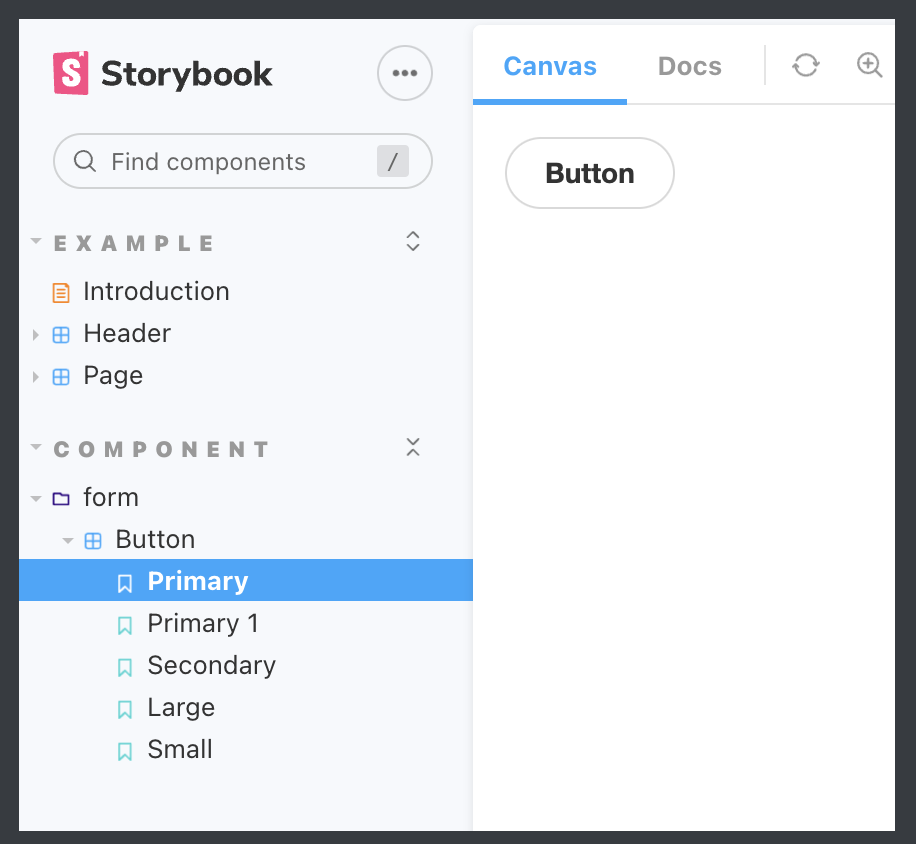
- Components/form/Button을 만들고 싶으면 아래와 같이 하면됨
- 위와 같이 Component라는 큰 폴더 안에 저렇게 표현이 가능하게 관리가 가능하다.
- title: 'Component/form/Button',
참고 자료
728x90
반응형
댓글